the prompt: to empower
As a woman myself, I love how women today celebrate femininity in so many ways. APHROA is my approach to that celebration using my own unique voice, designing a typeface that empowers and celebrates modern femininity through elegance, softness, and strength. The typeface aims to feel emotionally expressive and visually distinctive, with potential for both editorial and brand application across print and packaging.
Target Audience
APHROA is designed for women-identifying audiences who value intentional self-care, emotional depth, and refined aesthetics. It speaks to contemporary consumers in the wellness, beauty, and lifestyle space—particularly those who resonate with poetic storytelling, modern femininity, and elegant design. This audience seeks not just products, but experiences that affirm their worth and individuality.
design concept
APHROA is a high-contrast serif display typeface inspired by the forms of water, the rhythm of self-reflection, and the symbolism of feminine strength. The typeface features elegant waterdrop terminals, sculpted curves, and airy spacing—striking a balance between softness and structure. Designed with women in mind, APHROA transforms type into a vessel for affirmation.
aphroa
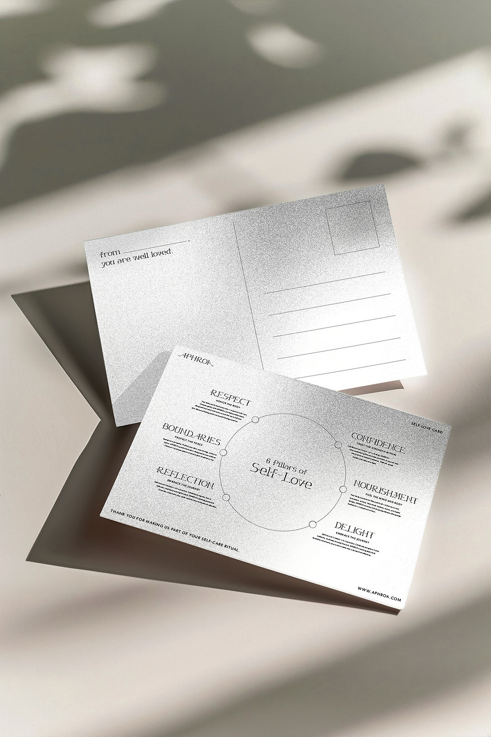
APHROA is a custom display typeface designed to embody fluidity, elegance, and feminine strength. Drawing inspiration from water forms, celestial motifs, and modern serif structure, the typeface features high contrast, smooth curves, and sculptural letterforms. Developed as a personal visual system, APHROA was applied in a series of self-love–themed posters, showcasing its expressive potential in editorial and identity-driven contexts.
Typeface Design
Editorial Design
Merch Design